Feeds:
Posts
Comments

Archive for the ‘Web Sites’ Category

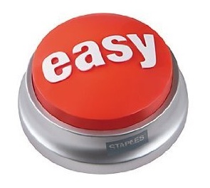
The famous Staples 'Easy Button'

The famous Staples 'Easy Button'

Can you be too easy? Well, your mother might disagree but the answer is an emphatic NO – you can never be too easy.

It’s all too easy to forget, but making things easy should be at the core of everything we do: easy for consumers to understand why they need our products; easy for customers/retailers to place orders and sell heaps of product; easy for consumers to buy what they want when they want it. All it takes is approaching every task you do by asking the bold yet simple question: “what can I do to make this easier”.

A great example is from author Jenny Blake and her recently launched book ‘Life After College’, introduced via the always interesting TheDominoProject. Jenny’s book is positioned as “an essential manual for every graduating student and young professional. It features practical, actionable advice that helps people focus on the BIG picture of their lives, not just the details”.

Getting great reviews and recommendations is key to a successful launch of any book (or product!) and it seems so often that brand custodians just cross their fingers that bloggers or other reviewers will take it upon themselves to spread the word. Jenny is doing it differently, by creating a resource on her website full of all the information that any blogger, reviewer or salesperson could need: check it out here.

She goes beyond the standard bio details, expanding to including sample tweets, emails and varying length synopses to promote the book, which can be easily copied and published in any medium. There are links to the book trailer on YouTube and links to the facebook page, as well as more formal and also quirky information about Jenny and links to previous interviews. Jenny is acknowledging that her supporters are busy and even with the best intentions getting time to create a mention promoting her book is tricky. Some will take up her suggestions verbatim, while others will edit a little to personalise: we all know that it is much quicker to edit an already prepared document than to start from scratch.

There are two key benefits here: firstly, the easier (and quicker) you can make it for people to spread the word, the more people will take up the opportunity. Secondly, through giving suggestions of how to word the comments, Jenny begins to create a consistent theme in how people talk about her book, resulting in a clearer, more focused message. Jenny’s approach recognises what we already know from our own lives: we are busy and the easier it is to get a job done the more likely we are to do it and do it well.

Making things easier can apply to absolutely everything we do, big or small:

• Is it easy to go through the checkout process on your site- do you force endless data entry and password setting up, or do you give shoppers the opportunity to buy quickly when they want to?
• When you submit your expenses to your boss do you write her name and the date in the approval box, so all she has to do is sign it?
• Is it easy to get into your shop? If the door is super heavy get it fixed, or if you cater to mums make sure a pram can navigate inside easily.
• When you get into work do you make sure the photocopier is stocked with paper so it doesn’t run out in the middle of a rush later in the day?

I love this statement from Eric Schmidt, EC of Google, (who interestingly Jenny Blake used to work for) describing their approach to employee benefits (note my bolding): “The goal is to strip away everything that gets in our employees’ way. We provide a standard package of fringe benefits, but on top of that are first-class dining facilities, gyms, laundry rooms, massage rooms, haircuts, carwashes, dry cleaning, commuting buses – just about anything a hardworking employee might want. Let’s face it: programmers want to program, they don’t want to do their laundry. So we make it easy for them to do both.”

Just taking those few seconds to ask the simple yet revolutionary question of “how can I make this easier” can change your world. So who do you know who’s making things easy? What have you done to make your world easier?
Read Full Post »

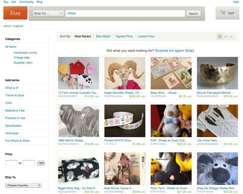
Today let’s have a look at the amazing Etsy, and two things they are doing fabulously. Firstly, customising the consumers’ experience through serving a different home page specifically for new visitors, and secondly, how they are communicating that change to their current users.

Etsy have done some exceptional work in creating a highly engaged online community, and once again they are raising the bar. To quote Wikipedia, “Etsy is a social commerce website focused on handmade or vintage items as well as art and craft supplies.” Whilst certainly a commerce site, the focus is definitely on the social, with an emphasis on highlighting the uniquely individual nature of the products, and importantly, their sellers: shopping and selling on Etsy is a very personal experience. Esty does some great work in creating online and offline communities which in turn create amazing engagement with the site. If you haven’t come across Etsy before have a look here for an intro.

Our focus today is on a new initiative they are trialling for their homepage. The insight is that a new visitor to a site has different needs to a regular visitor: more focus on ‘what is it?’, ‘how does it work?’, and ‘give me a connection quickly’ (a reason to dig more deeply, or to come back) before I click onto my next search: sounds pretty basic really. Clearly many brand owners try to cater to this with varying degrees of success by incorporating elements which talk to the new and repeat consumer throughout the site, but how many brands really live this by presenting a customised experience to a new visitor?

Etsy are in the process of trialling a completely different homepage for a new visitor. The details of the change are discussed here. I love the ‘Taste Test’ tool they are featuring on it: reminds me of a more PC version of the “which girl is better looking” game from “The Social Network”. It’s worth a go and interesting how a spin of this revealed a whole new world of objects I wouldn’t even have thought to look for.

Etsy’s approach to executing this change is interesting too: in their announcement they are sharing the change, the reason why, and how they are going to trial it: letting seasoned (and highly engaged !) users be part of the process. It would have been so easy for the Etsy team to have just made the change and got on with it, but they recognise that if they take their community along with them they will ultimately get a better result: building higher engagement with current users and more effective conversion from new visitors.

So how do you customise your consumers’ experiences with your brand? Offline and on, show me who you think is doing a great job of this.

Read Full Post »

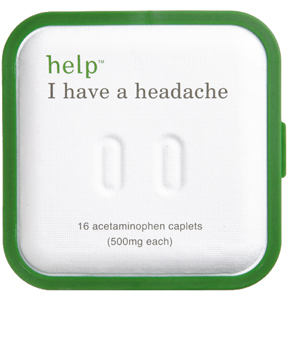
Help I have a headache, from Help Remedies.

Do pharmaceutical brands need to be so boring? An intriguing brand arrived in my inbox this morning courtesy of Contagious Magazine. Products from the pharmaceutical industry seem unified in their loud, blustery voice as they force their way into being the essential salvo to every little ill. Effective as this approach is (these are BIG brands with BIG spends and profits to match) when everyone is doing the same thing it becomes boring, and when boring translates to low engagement, ultimately a weakness.

So let’s look at someone who is doing it differently: Help Remedies is a US based company which offers a tight range of simple, practical essentials which can fix a headache or protect a cut.

The packaging is fantastic: clean, clear design, with very straight forward naming “Help, I have a headache” is the name of the headache pills, “Help I can’t sleep” for sleeping pills, and “Help I’ve cut myself” for sticking plasters: you get the idea.

They have taken the sleeping aid even further by ‘helpfully’ suggesting different dream ideas, and these are brought to life beautifully in some otherworldy ads which I am sure are generating some great viral. Read Contagious Magazine’s take on the ads here. It would be interesting to know how mainstream the media buy is.

Pricing is super-simple: each product costs the same (although with a differing number of pills per pack) – this is spot-on for a brand promising to help simplify things.

The “bored?” page is worth a look, bringing to life the brand with some clever, very obscure help for a variety of esoteric ailments – actually more than some, I liked that there were a lot of things to play with on this page, these dalliances are not just some add-on from marketing, they are central to bringing the brand to life in a less traditional way. The “I’m Sleepy” is addictive! On the home page try clicking on all the packs to make them all disappear, and then see what happens: it’s touches like these which flag the design and advertising backgrounds of the founders.

This irreverent approach to the category is refreshing, I look forward to seeing what they do next.

Read Full Post »

The words from this post made beautiful by Wordle

Today I am looking at a web site –”www.myessentialsalyceplatt.com.au“. I remember her as the barrel girl on Sale of the Century, but she is also an actor, singer and now designer. This site has just three products, a lightweight sun-wrap (think kimono’ish with multiple ways of tying), a dress and a monocle/magnifying glass cut into an interesting shape and worn as a pendant on a necklace (for reading tiny font on mobile phones and menus – very clever and much more glamorous than squinting and complaining about bad lighting).

The thing I love about this site is its focus: just three clever products (with a few different colour/fabric combinations) which have been created because someone thought “why can’t I get that?” So many sites are overwhelming with their offers, yet this tight range is simple and easy to understand. The interesting thing is that she doesn’t seem to have specific manufacturing or design experience – she had the idea, created some drawings and went off and found a manufacturer. Of course the inspiration in this is that if she can do it so can you.

That said, she does have the benefit of some pretty well-known friends (plus her own profile) to help spread the word in mainstream media – but people who are not famous manage to sell things everyday too.

So, what do I like?
Great focus, simple and well executed idea and site – pricing is accessible (I know that’s always a subjective one) – clear pictures of how the outfits look in the different colours as well as a “how to wear” info sheet.

What would I change?
More information on what the fabrics feel like: even better, include videos showing the fabric moving/being worn. It can be tricky to know how fabric will drape from a static shot, and when shopping online any uncertainties can be a block for your shoppers: they need to say “I want it now”, rather than a “I’m not sure, I’ll think about it”.

Make it easy to tweet, facebook or blog it on: add some links/widgets for these on the front page: even though the target market looks a bit older these guys are still online and talking.

So overall, great idea nicely executed: I hope it does well.

Note: the image at the top is created by entering the text from this post into the very cool Wordle site.

Read Full Post »