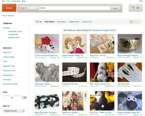
Today let’s have a look at the amazing Etsy, and two things they are doing fabulously. Firstly, customising the consumers’ experience through serving a different home page specifically for new visitors, and secondly, how they are communicating that change to their current users.
Etsy have done some exceptional work in creating a highly engaged online community, and once again they are raising the bar. To quote Wikipedia, “Etsy is a social commerce website focused on handmade or vintage items as well as art and craft supplies.” Whilst certainly a commerce site, the focus is definitely on the social, with an emphasis on highlighting the uniquely individual nature of the products, and importantly, their sellers: shopping and selling on Etsy is a very personal experience. Esty does some great work in creating online and offline communities which in turn create amazing engagement with the site. If you haven’t come across Etsy before have a look here for an intro.
Our focus today is on a new initiative they are trialling for their homepage. The insight is that a new visitor to a site has different needs to a regular visitor: more focus on ‘what is it?’, ‘how does it work?’, and ‘give me a connection quickly’ (a reason to dig more deeply, or to come back) before I click onto my next search: sounds pretty basic really. Clearly many brand owners try to cater to this with varying degrees of success by incorporating elements which talk to the new and repeat consumer throughout the site, but how many brands really live this by presenting a customised experience to a new visitor?
Etsy are in the process of trialling a completely different homepage for a new visitor. The details of the change are discussed here. I love the ‘Taste Test’ tool they are featuring on it: reminds me of a more PC version of the “which girl is better looking” game from “The Social Network”. It’s worth a go and interesting how a spin of this revealed a whole new world of objects I wouldn’t even have thought to look for.
Etsy’s approach to executing this change is interesting too: in their announcement they are sharing the change, the reason why, and how they are going to trial it: letting seasoned (and highly engaged !) users be part of the process. It would have been so easy for the Etsy team to have just made the change and got on with it, but they recognise that if they take their community along with them they will ultimately get a better result: building higher engagement with current users and more effective conversion from new visitors.
So how do you customise your consumers’ experiences with your brand? Offline and on, show me who you think is doing a great job of this.


